About Me
Monday, 29 March 2010
Sunday, 28 March 2010
Wednesday, 24 March 2010
Screen Printing
Tuesday, 23 March 2010
Final Crit boards
Website

This is only some of the web pages but they include a home page, a subscription page, a forum, a text app and a text service.


This is only some of the web pages but they include a home page, a subscription page, a forum, a text app and a text service.
Home page- possibly too much text, needs image as well, something which was raised in the crit.

Name of the website, the logo/ image we are going to use, pretty basic but it fits in with the style of everything. Also below are the text service and phone app pages of the website, they include basic imagery and a summary of what the services include and how to access them.


Name of the website, the logo/ image we are going to use, pretty basic but it fits in with the style of everything. Also below are the text service and phone app pages of the website, they include basic imagery and a summary of what the services include and how to access them.


This is the typeface we have used throughout, mostly for headings and titles, Green Pillow is the name of it.


The booklet- after the crit last friday we were told to narrow our topic down to just one lot of lying, so we focused it on homework excuses,this changed the content of the book slightly but we just made it two pages of excuses and two pages of excuses to stay clear of. This made it less busy and gave us more room to focus on one specific thing. We tried out the book on two different stocks, brown paper, and a thicker paper but are still unsure which too use. The problem with the brown paper is that for a double sided poster, the ink appeared to seep through the other side.


These are possible designs for the back of the hotdog fold book so that when it is folded out it's a basic poster, simply with the hippo design on the back. I personally prefer the larger hippo on the brown paper. We could overcome the ink seeping through by spray mounting two pages together but this could affect the quality.

Content of booklet

We discussed the content of the booklet, what excuses we were going to use etc. We had gathered some of this from internet research along with a small survey around the class.
We also decided that as the topic of lying would not go down with parents that we should make the name of the website and whole company something completely irrelevant to the theme of what we are actually doing. So we came up with the name Hippos in the happy place.
We also decided that when the hotdog book folds out, on the other side would be a poster, again something completely irrelevant so parents aren't aware of what the booklet is. This could then be put up on someone's wall and no-one would ever know except the student and then use the excuses on the other side whenever they need to.


So, because of the irrelevant name we thought we best come up with some imagery to support this and something that we can use throughout the projects, I attempted some hippo drawing but pretty much failed.

The mock up of the book on plain white paper for now.
Development

After deciding on the content of the book, including a small section on body language, excuses for no homework etc and an introduction, I did some small basic drawings to go alongside this to make the book more visual. I tried out some eyes for body language and alarm clocks for lateness along with gym shoes and t.v's for being lazy etc.
Tuesday, 16 March 2010
Communication is a virus- feedback from crit
What is a line
After deciding on documenting our flat kitchen every morning and evening, I put the photos I had so far together. I think the subject matter may be too boring, I like the idea of having subtle differences from day to day and then with a larger amount of photos an end product of a flipbook or video would be something I would like to create.
Monday, 15 March 2010
Concept, Content, Method of delivery


These are our three boards for the first crit, we produced a board for out concept, content and the method of delivery.
Our concept involved how to tell a lie convincingly in high school, aimed at 12-16 year olds. We tried to make it clear that we are not promoting lying but simply trying to help school kids get themselves out of trouble.
Our content included a list of excuses for things like late homework and missing school. We wanted to use both type and image and use a notebook style doodle style within this.
Lastly our method delivery was an interactive website which would include a forum for pupil to share their excuses. Also a phone app and a free booklet with some helpful excuses in it.
Communication is a virus
I looked into lying and what a lie was, I also looked into how to tell a good lie, this involved things like planning a lie and body language.

In order to find our audience we produced a quick survey to find out when people have lied most from the choices, high school, aprents, workplace, primary school or friends. Out of the people we asked the result was half choosing high school. So from this I looked into ways of reaching this age rande, high school pupils-aged roughly 12-16.


In order to find our audience we produced a quick survey to find out when people have lied most from the choices, high school, aprents, workplace, primary school or friends. Out of the people we asked the result was half choosing high school. So from this I looked into ways of reaching this age rande, high school pupils-aged roughly 12-16.


Marketing teenagers and reaching out to them to communicate something these days seemed most appropriate through technology. Mainly internet, tv or mobile phone, something intewractive.

As out project is intended to be light hearted I looked into existing excuses used at schools for things like having no homework, the typical 'my dog ate my homework' etc.


As out project is intended to be light hearted I looked into existing excuses used at schools for things like having no homework, the typical 'my dog ate my homework' etc.

I also looked into how to tell if someone is lying, including things like body langauge and tone of voice. I cam across a quite in depth explanation of eye contact and direction of eyes in order to read someone lying.

We looked into the possibility of an interactive website and discussed the pros and cons of different media and our audience. Looking at the possibility of distirbuting our webstie through social networking sites we worried that our audience may not fit into this group. However after some more research and looking at a facebook user survey, the percentage of users aged 13-16 was relatively high and so this put to rest any worries.


We looked into the possibility of an interactive website and discussed the pros and cons of different media and our audience. Looking at the possibility of distirbuting our webstie through social networking sites we worried that our audience may not fit into this group. However after some more research and looking at a facebook user survey, the percentage of users aged 13-16 was relatively high and so this put to rest any worries.

Communication Is a Virus


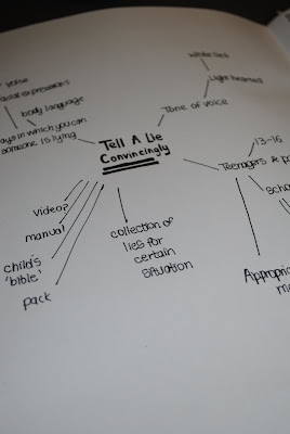
Fortunately in our group we decided on which area we wanted to work with, Tell a lie convincingly because we thought we would be able to have fun with this and approach it with a light hearted view. From this we started by brainstorming a few quick initial ideas, including audience, tone of voice and types of lies.
Monday, 8 March 2010
Final book
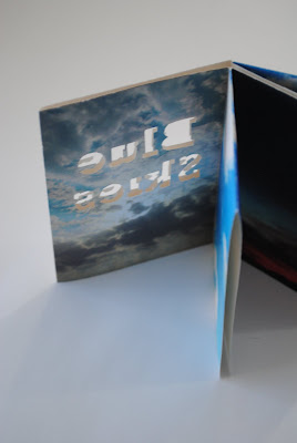
For the final design I printed the title 'Blue Skies' on the cover and cut them out so that the blue sky from the image inside would show through onto the white front cover.
Book development
First of all I had the idea of using the front cover as a window which would somehow open up to show the sky behind it. However, this proved to be quite difficult because since the book only contains 6 pages without back and front it would be wasting two pages of the book. Also I found it difficult to open up the window itself.
Subscribe to:
Comments (Atom)


.JPG)
.JPG)
.JPG)


